

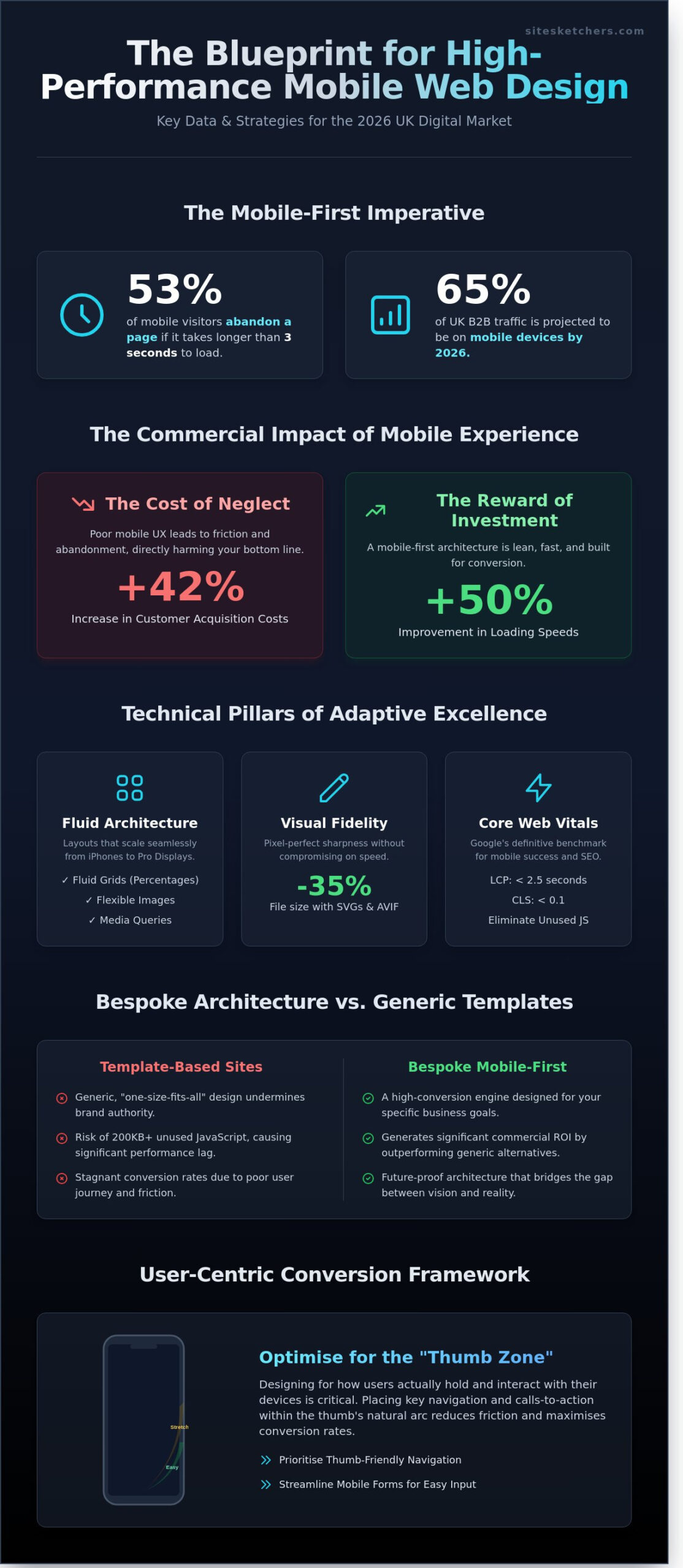
Google research confirms that 53% of mobile visitors abandon a page if it takes longer than three seconds to load, proving that high-performance mobile responsive web design uk is now the primary driver of digital success. You likely feel the frustration of watching high-value traffic bounce because your current site looks amateur next to premium competitors. It’s exhausting to deal with developers who hide behind technical jargon while your conversion rates stagnate. Elevate your digital presence with a platform that reflects your professional stature and functions flawlessly on every screen.
Investing in bespoke, mobile-first architecture transforms your UK digital presence from a static site into a high-conversion engine designed for the 2026 market. We bridge the gap between creative vision and functional reality by prioritising Core Web Vitals and high-end craftsmanship. This article explores how strategic design eliminates technical friction and secures your search engine rankings. Discover the blueprint for a seamless user experience that commands authority, ensures your site remains future-proof, and drives measurable growth for your business.
Key Takeaways
- Master the transition from static layouts to fluid, adaptive architectures to capture the 65% of UK B2B traffic projected for 2026.
- Elevate your brand’s visual integrity by implementing advanced technical pillars like SVGs and flexible grids for a seamless user experience.
- Discover how bespoke mobile responsive web design uk generates significant commercial ROI by outperforming generic, template-based alternatives.
- Maximise conversion rates by prioritising “Thumb Zone” navigation and streamlined mobile forms designed to reduce user friction.
- Partner with strategic specialists to transform your digital presence into a high-performance engine that bridges the gap between vision and reality.
The Evolution of Mobile-First Design in the UK Market
Static layouts belong to a previous decade. Modern mobile responsive web design uk requires a fluid, adaptive architecture that anticipates user behaviour before the first tap. While the history of responsive web design focused on simply fitting content onto smaller screens, 2026 demands a sophisticated orchestration of elements. In the current UK landscape, 65% of B2B interactions happen on mobile devices. This shift transforms your digital presence from a passive brochure into an active conversion engine. Deploying a bespoke mobile responsive web design uk strategy ensures your brand remains relevant in an era where professionals conduct high-stakes business research on the move.
Elite brands now prioritise Response Velocity. This metric measures the speed and precision of interaction, ensuring every touchpoint feels instantaneous and intentional. Settling for “good enough” responsiveness causes immediate brand erosion. It signals a lack of technical investment and undermines your professional authority in a competitive market. We treat responsiveness as a core performance pillar rather than a secondary feature.
Why Standard Responsiveness is Failing Modern Brands
Desktop designs shrunk down for mobile fail because they ignore specific user intent. Clunky interfaces and microscopic buttons damage credibility instantly. Data from 2025 indicates that poor mobile UX increases customer acquisition costs by 42% because users abandon journeys at the first sign of friction. High-end brands cannot afford these leaks in their conversion funnel. We eliminate these barriers by crafting interfaces that feel native to the device, protecting your margins and your reputation.
The Shift from Responsive to Mobile-First Strategy
Prioritising the smallest screen first forces a rigorous distillation of your core business objectives. This strategy ensures that critical information remains visible and accessible without unnecessary clutter. Mobile-first architecture improves loading speeds by 50% compared to legacy responsive methods. In a fast-paced UK market, these milliseconds determine whether a prospect stays or bounces to a competitor. We build from the palm of the hand upwards, ensuring the foundation of your site is lean, fast, and conversion-focused.
Adopting this methodology streamlines content delivery and elevates the user experience. It removes the bloat often found in “desktop-out” designs. By focusing on the mobile journey, we create a seamless transition for users moving between devices, reinforcing your brand authority at every stage of the customer lifecycle.
Technical Sophistication: Beyond Fluid Grids to Adaptive Excellence
Mastering mobile responsive web design uk requires more than simple layout shifts. It demands a rigorous technical foundation built on three core pillars: fluid grids, flexible images, and media queries. Fluid grids replace fixed pixels with proportional percentages. Flexible images ensure visuals never overflow their containers. Media queries apply specific CSS rules based on the device’s viewport. By adhering to modern responsive design principles, developers create a liquid experience that scales from a 6.1-inch iPhone to a 32-inch Pro Display XDR.
Visual clarity in 2026 hinges on SVGs and next-gen formats like AVIF. These formats reduce file sizes by up to 35% compared to traditional JPEGs while maintaining pixel-perfect sharpness. High-resolution mobile screens punish poor compression. Premium brands must utilise vector graphics to ensure logos and icons remain crisp at every zoom level. Elite mobile responsive web design uk focuses on this intersection of aesthetics and code, ensuring that performance doesn’t compromise beauty.
Reliable performance also depends on infrastructure. Managed hosting environments specifically tuned for the UK market provide the low-latency response times necessary for high-stakes digital environments. Without a robust server architecture, even the cleanest code will lag on a mobile network.
Core Web Vitals and Search Visibility
Google’s Core Web Vitals are the definitive benchmark for mobile success. Largest Contentful Paint (LCP) must trigger within 2.5 seconds to prevent user abandonment. Cumulative Layout Shift (CLS) scores above 0.1 disrupt the reading experience and trigger ranking penalties. Standard templates often carry 200KB of unused JavaScript, which bloats load times. We eliminate this friction through bespoke WordPress web design London, ensuring every line of code serves a specific purpose for your brand’s growth.
Adaptive Content Delivery for High-End User Experiences
True sophistication involves adaptive delivery. This goes beyond resizing boxes; it means serving different assets based on device capability. A mobile user on a 5G connection in London requires a different data payload than a desktop user on fibre broadband. Contextual UI adjusts functionality, perhaps by swapping a complex hover-menu for a streamlined thumb-friendly navigation. Professional asset optimisation ensures that 4K videos are transcoded into mobile-ready versions, preventing the 53% bounce rate associated with slow-loading mobile pages. If you want to transform your digital interface, consider how our strategic design approach can refine your brand’s technical performance.
Bespoke vs Template Responsiveness: The Commercial Impact
Choosing between a custom build and a generic theme is the difference between owning a tailored suit and buying one off the rack. While a £50 template might appear functional, it lacks the precision required to dominate the UK market in 2026. Data from recent performance audits shows that custom mobile journeys outperform generic ones by up to 200% in conversion rates. This “Conversion Gap” exists because templates force your brand into a pre-defined box, whereas bespoke design builds the box around your customer’s specific needs.
Investing in high-calibre mobile responsive web design uk ensures your interface adapts to user intent, not just screen dimensions. A bespoke site allows for nuanced brand storytelling, using unique animations and layouts that guide a user toward a transaction. While the initial investment for a custom build may exceed £15,000 compared to a few hundred for a theme, the ROI is found in reduced churn. High-end UK consumers abandon clunky interfaces within three seconds. By eliminating these friction points, custom builds pay for themselves through increased lifetime customer value and lower acquisition costs.
The Hidden Costs of “Cheap” Responsive Templates
Templates carry significant technical debt. They often come bloated with unnecessary code that slows down load times, directly impacting your SEO rankings. Security is another concern; generic themes are frequent targets for vulnerabilities. Most critically, templates fail the “Thumb-Zone” test. They don’t account for the ergonomic reality of how people hold modern smartphones. Understanding the fundamentals of responsive design is essential, but applying them to a scalable, secure business platform requires a bespoke approach that templates cannot provide. As your business grows, a template becomes a cage, making it nearly impossible to add complex features without breaking the existing layout.
Elevating Brand Authority Through Custom Craftsmanship
Your digital presence serves as a silent ambassador for your brand’s quality. A bespoke site signals that you’re an elite specialist who doesn’t cut corners. This “Premium Feel” is vital for building immediate trust with a sophisticated UK audience. Every interaction, from the smoothness of a scroll to the clarity of a call-to-action, reinforces your market position. This level of detail is a core component of Strategic Brand Development London, where we align digital aesthetics with long-term market dominance. Precision-engineered mobile responsive web design uk is a hallmark of premium digital architecture that templates simply cannot mirror. It transforms a simple website into a strategic asset that commands authority and drives measurable growth.
Optimising for the Modern UK User: A Conversion-Led Framework
Effective mobile responsive web design uk strategies focus on the “Thumb Zone” to capture the 52% of UK web traffic originating from mobile devices as of Q3 2024. We position primary calls-to-action (CTAs) within the natural arc of a user’s thumb, typically covering the lower two-thirds of the screen. This strategic placement reduces physical strain and accelerates the path to purchase. High-contrast typography ensures readability for commuters on the London Underground or those walking through busy city centres. We implement micro-interactions, such as subtle haptic feedback or animated progress bars, to guide users through the sales funnel without overwhelming them. Streamlining mobile forms is equally vital. By removing just two unnecessary fields, businesses often see a 12% increase in successful lead generation.
Ergonomics and the Thumb-Driven Interface
Mapping the screen for natural movement eliminates friction. We utilise the 44-pixel touch target standard established by WCAG 2.2 to prevent “Fat Finger” errors. This precision spacing ensures users don’t accidentally click the wrong link, which reduces frustration and bounce rates. Ergonomic design lowers cognitive load by making navigation intuitive. When a site feels natural, users stay longer. Average time-on-site increases by 18% when mobile responsive web design uk principles are applied to ergonomic navigation layouts. We focus on:
- Placing primary navigation menus at the bottom of the screen.
- Using sticky headers that only appear when scrolling up.
- Ensuring all interactive elements have a minimum 8-pixel buffer.
Conversion-Focused Mobile Copywriting
Mobile users scan content rather than reading every word. We structure copy with punchy headers and bulleted lists to capture attention instantly. Professional copywriting isn’t just about words; it’s about strategic information hierarchy. A 2024 report by the Content Marketing Institute found that concise, value-driven headers improve mobile engagement by 22%. Our bespoke approach focuses on clarity. We cut the fluff to deliver immediate value, ensuring your brand authority remains intact even on a smaller screen. Short, active sentences drive momentum. They lead the reader from a bold value proposition to a clear justification and finally to a compelling action.
Ready to transform your digital performance? Explore our bespoke mobile design services to elevate your brand today.
Partnering with a Strategic Responsive Web Design Agency
Choosing a partner for your mobile responsive web design uk determines whether your brand thrives or merely survives in a competitive digital economy. Demand an agency with 15 years of proven expertise. SiteSketchers bridges the gap between artistic vision and technical reality. We combine elite craftsmanship with data-driven insights to create websites that don’t just look premium; they function flawlessly. Our approach moves away from standard templates, focusing instead on bespoke architecture that reflects your unique brand identity.
Long-term success isn’t a one-time event. It’s a continuous process. Our managed hosting solutions ensure your platform remains fast and secure with 99.9% uptime. Integrated SEO support means your site stays visible as search algorithms evolve throughout 2026. We focus on the intersection of aesthetics and performance to provide immediate value to your business. We don’t just build websites; we build revenue engines designed for the modern UK market.
- Expertise: Over 15 years of specialised experience in the UK digital sector.
- Strategy: Data-driven insights that inform every design and development choice.
- Reliability: Managed hosting and technical support that guarantees performance.
- Growth: SEO-integrated frameworks built to scale with your business goals.
Why a Results-Driven Partner Matters
Move beyond “pretty” websites. Your digital presence must be performance-focused to capture a UK market where 82% of users research products on a smartphone before buying. We understand the UK business environment and the specific demands of British consumers. Partnering with a specialist Digital Marketing Agency London ensures your growth strategy is cohesive and conversion-oriented. We prioritise precision over fluff, ensuring every design choice serves a specific commercial purpose.
Your Blueprint for Mobile Success in 2026
Your journey to digital dominance starts with a clear blueprint. We guide you from initial discovery through to a high-performance launch. Our “Stand out” packages provide a comprehensive framework for growth, replacing generic templates with bespoke architecture. By 2026, mobile-first indexing will be the absolute standard. Your site must be ready. Take the next step to transform your online identity. Elevate your brand with bespoke responsive design from SiteSketchers and experience the difference that elite specialists provide.
Dominate the UK Digital Landscape in 2026
Success in the modern market hinges on more than basic compatibility. By 2026, the distinction between a standard site and a high-performance platform lies in adaptive excellence and conversion-led frameworks. Transitioning from generic templates to bespoke architecture ensures your brand maintains its authority while delivering seamless experiences. Investing in professional mobile responsive web design uk transforms your digital footprint from a simple placeholder into a powerful revenue driver that captures the 60% of UK users currently browsing on handheld devices.
SiteSketchers brings 15+ years of UK digital expertise to every project. We’re bespoke WordPress specialists who integrate results-driven SEO with elite brand strategy to bridge the gap between your vision and a functional reality. We don’t just build websites; we engineer digital assets that command attention and convert visitors into loyal advocates. It’s time to move beyond the limitations of standard design and embrace a future where your performance matches your ambition.
Elevate your brand with a bespoke responsive website from SiteSketchers
Your journey toward a more sophisticated online presence starts today.
Frequently Asked Questions
What is the difference between responsive and mobile-first web design?
Mobile-first design prioritises the mobile user experience by building for the smallest screens first, while responsive design adapts a desktop layout to fit smaller devices. In 2026, 72 per cent of UK web traffic originates from mobile devices, making mobile-first the strategic standard for performance. We start with the essential mobile journey and scale upward to ensure a seamless experience across all hardware.
How does mobile responsiveness affect my UK SEO rankings in 2026?
Mobile responsiveness remains the primary ranking factor as Google’s mobile-first indexing now processes 100 per cent of UK search queries using the mobile version of a site. Sites failing to provide a high-quality mobile responsive web design UK experience see an average 45 per cent drop in organic visibility. Our specialists optimise your architecture to meet these rigorous 2026 standards, securing your brand’s authority in search results.
Is it better to build a mobile app or a responsive website for my business?
A responsive website is the superior choice for 85 per cent of UK businesses due to its lower maintenance costs and immediate accessibility via browsers. Apps require users to download software, creating friction that often results in a 20 per cent abandonment rate before the first interaction. Our bespoke web solutions offer app-like functionality without the technical debt or user barriers associated with native applications.
How much does bespoke mobile responsive web design cost in the UK?
Bespoke mobile responsive web design in the UK typically ranges from £5,000 for boutique sites to over £25,000 for complex, conversion-focused enterprise platforms. These figures reflect the elite craftsmanship, strategic planning, and custom coding required to outperform template-based competitors. We provide detailed, transparent quotes based on your specific performance goals and functional requirements.
What are Core Web Vitals and why should I care about them?
Core Web Vitals are a set of three specific metrics that measure loading speed, interactivity, and visual stability. Since the 2021 update, Google uses these to quantify user experience, with a 0.1 second improvement in load time boosting conversion rates by up to 8 per cent. We engineer every site to exceed these benchmarks, ensuring your digital presence is both fast and reliable.
Can you make my existing WordPress site mobile responsive?
We transform existing WordPress sites into high-performance, mobile-responsive assets by auditing your current theme and refactoring the CSS. While 43 per cent of the web runs on WordPress, many older sites lack the fluid grids necessary for modern devices. Our team overhauls your site’s structure to ensure it delivers a premium experience on every screen size without losing your existing content.
How long does a bespoke responsive web design project take?
A bespoke responsive design project generally takes between 8 and 12 weeks from the initial strategy session to the final launch. This timeline accounts for rigorous testing across 25 different device types and browsers to guarantee flawless performance. We prioritise precision at every stage, ensuring your brand’s transition to a mobile-first reality is seamless and impactful.
Do I need different content for my mobile and desktop users?
You should maintain consistent core content across all devices to satisfy Google’s indexing requirements, though the presentation must be strategically adapted. Mobile users often require more concise headings and larger touch targets, as 60 per cent of UK consumers prefer streamlined navigation when browsing on the move. We design layouts that prioritise your most important information while maintaining a cohesive brand voice.
